IDEAS
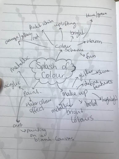
MOOD BOARD:
I am going to use make-up and paint and incorporate it with my colour theme, in order to present how colour brings a picture to life.

DIVINA WONG
|
|
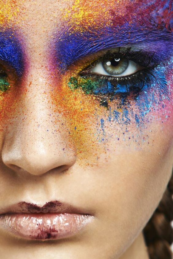
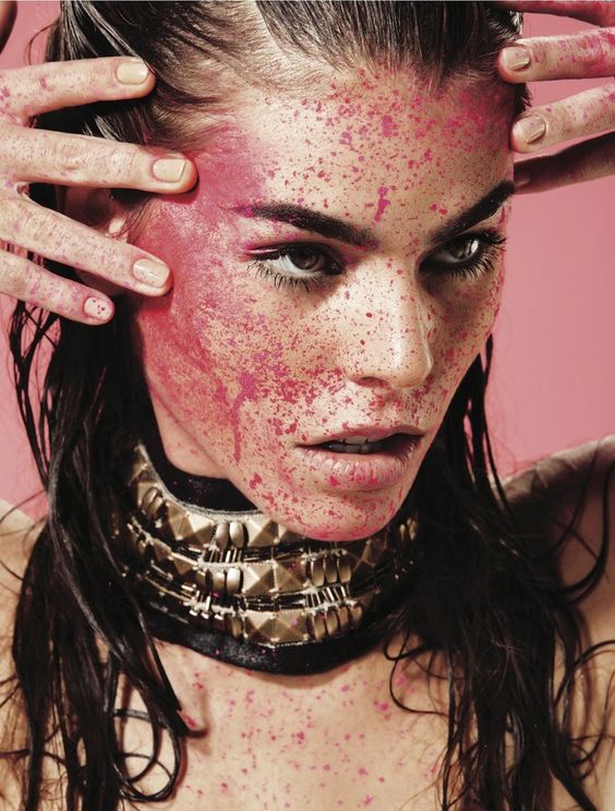
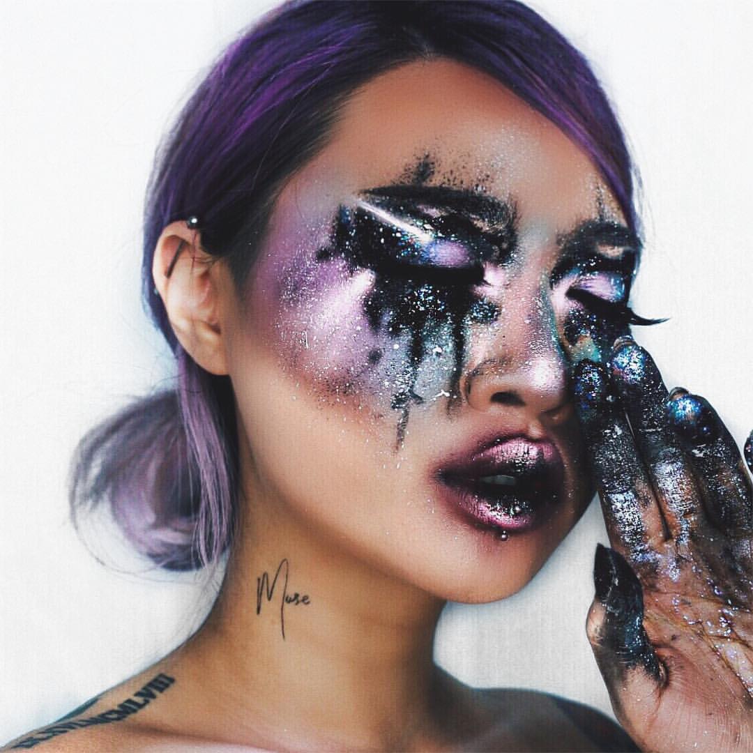
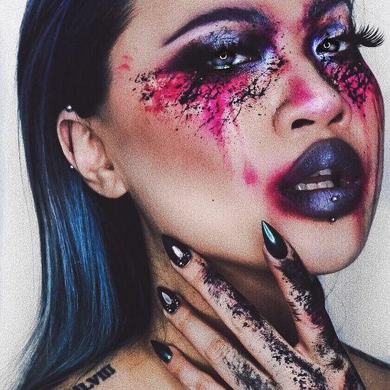
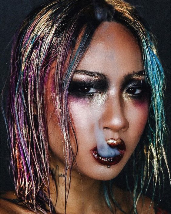
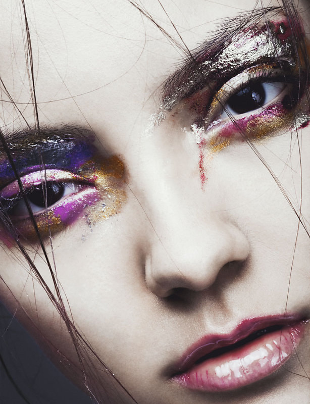
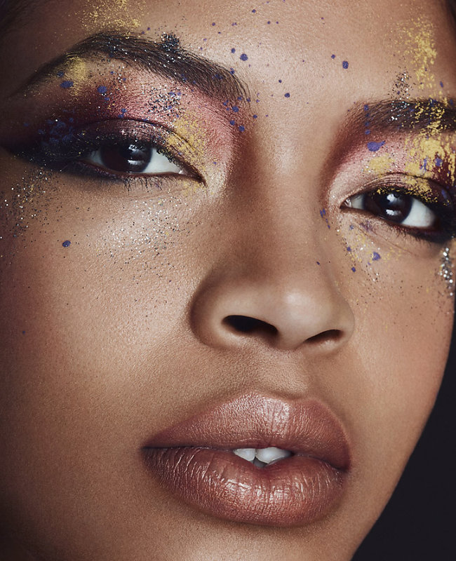
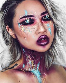
Divina Wong, AKA Divina 'muse' on instagram, is a make up artist that is known well on the social media app instagram. There is not much information on Divina Wong herself. I was drawn to her precise artistic skills of art work using herself as the canvas, varying from bright colours to black and white makeup/face paint. Her art is what I aspire to recreate in my own ways using bright colours on my models to create a painting like finish. |
|
This is one of my favourite pictures by Divina as the colours are homonious and gives out a positive vibe. I admire how she coordinates the colours and uses the darker colours to create depth and in order to make the lighter colours stand out; this causes the colours to become more luminous to the eye. When you look at this picture you see a satisfying aesthetic in which causes you to appreciate the picture more. This image boosts self confidenece and is a very lively piece of artwork. |
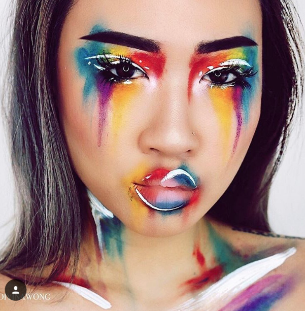
ANDRA
|
|
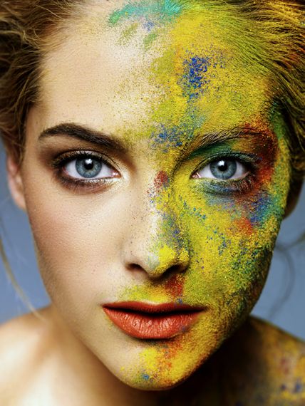
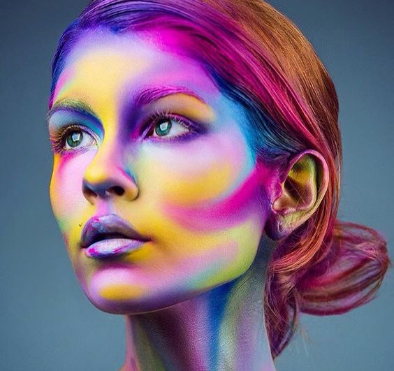
Andra began her photography career over 15 years ago when portraying a collection of celebrities s uch as Jette Joop, Tommy Hilfiger, Peter Maffay and many more. Andra had completed her photography degree at the academy of photography in Hamburg in 2003. Andra founded her second buisness and has revieved numerous awards for work. Her main focus is fashion and beauty photography; she has an amazing eye and is very creative in expressing her ideas. What I admire about her photography is her use of colour, hence why I have chosen her as one of my artists as her work inspires me. I especially love her use of vibrant and bold colours as it draws attention to the details and features of the models appearance. I wish to use her work as inspiration for my 'splash of colour' unit. |
RANKIN
|
|
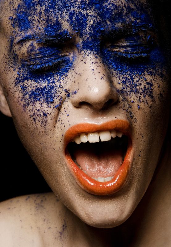
John Rankin Waddell was born in 1966, he is also known under his working name Rankin; Rankin is a British portrait and fashion photographer. Rankin attended Thirsk School and Sixth Form College whilst studying accounting at Brighton Polytechnic, he discovered that his interests lay elsewhere and dropped out, taking up the study of photography at Barnfield College Luton and then went to London College of Printing. During this time, Rankin met Jefferson Hack, with whom he formed a working relationship. In 1992, after they graduated, the two came up with the idea to start a magazine together, called Dazed & confused. In December 2000 Rankin began his own quarterly fashion magazine, Rank. He also publishes Another Magazine, Another Man and more recently Hunger, a website and biannual fashion and lifestyle magazine. Rankin has a work with a lot of famous people, and is a well known fashion photographer world wide.
What drew me to his work was his use of radiant and luminous colours. Rankin is one of my favourite photographers and is a huge inspiration in my work and he will be an extensive influence to my colour photography. |
Photo shoot one - experiment
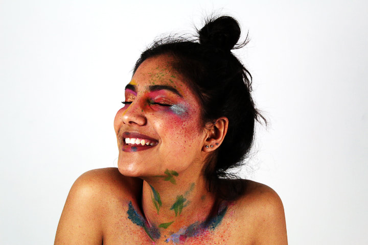
For this photoshoot I wanted my model to have her hair up as it meant that more colour was shown. I applied watercolour paint as it has a lighter consistensy, however I did find that because of this I had to apply more paint to avoid the colour looking washed out. I also used highlight to create a shimmer on the eye lids and applied a heavy amount of eye shadow in order for it to stand out against the models complextion. The look I was going for was an artistic watercolour painting in which I feel I have achieved. I managed to get the consistency right and the multiple colours I used such as blues, pinks, greens and oranges; these colours complemented each other well. Overall I am happy with my first attempt.
Strongest Pictures;
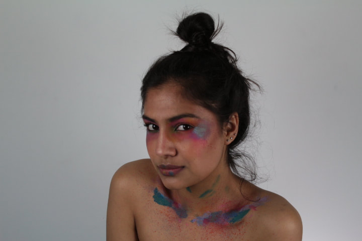
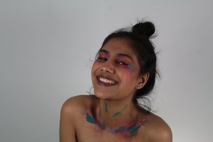
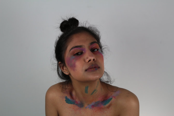
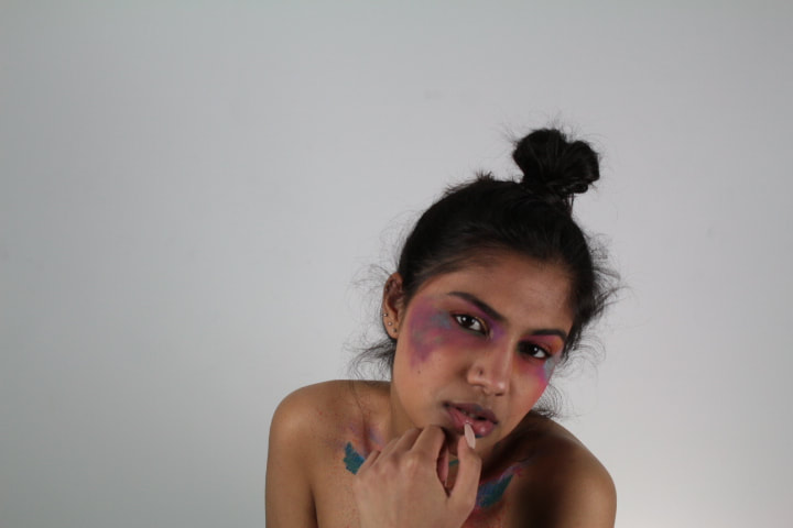
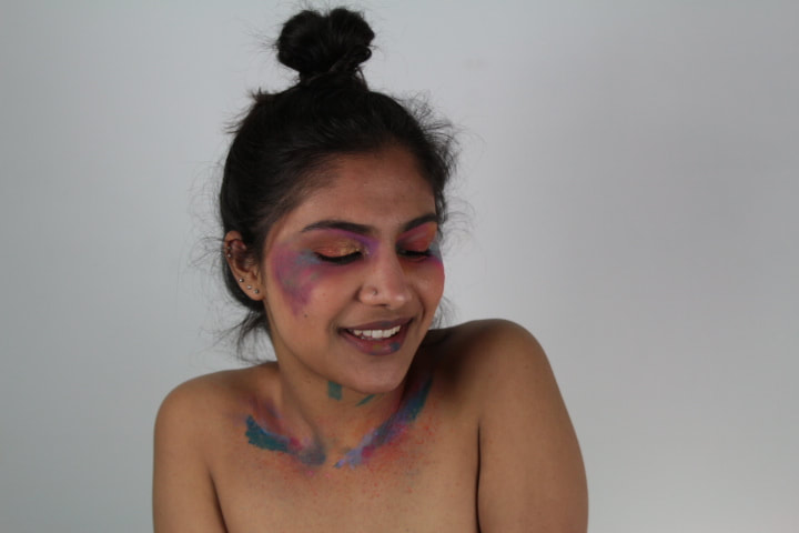
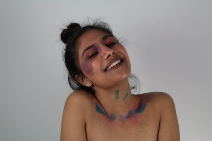
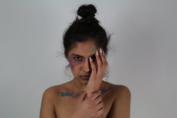
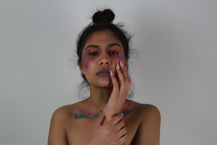
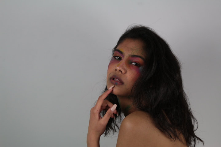
I have chosen these images as my strongest as each individual photograph stands out. The colours add drama to photographs, as does the body language and facial expresions, the model plays about with her expressions going from a cute smile to a more seductive expression creating character in the photographs. Despite the lighting not being as bright as I had planned the overall final pictures show good quality and look professional, creating an exciting aesthetic. I am pleased with the outcome of each photograph and feel that once I have used photoshop I can make the colour more vibrant and stand out more against the models complextion.
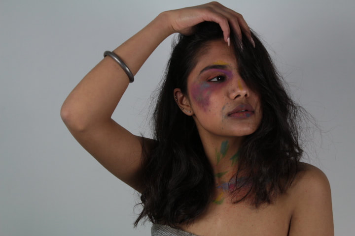
Photo shoot two
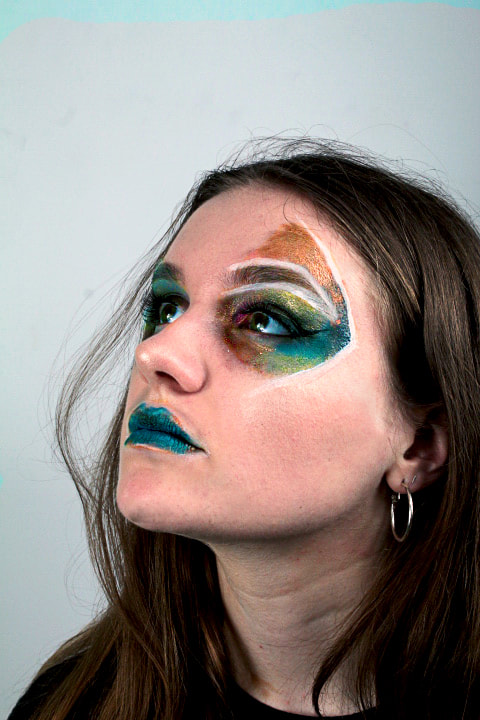
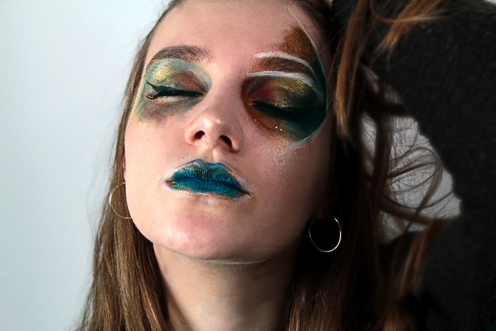
My second attempt went successfully as I applied more make-up which made it more intense on the camera. For this photoshoot I decided I wanted to add more shimmer, therefore I went for some metallic liquid eyeshadows, these were really pigmented and exhibited a much more vibrant finish. I focussed my colour paint around my models eyes and on herlips, this produced a satisfying and abstract finish, making the pictures stand out more and appear more futuristic as her features shone.
Strongest Pictures;
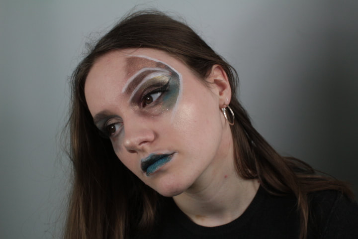
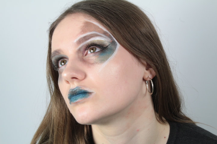
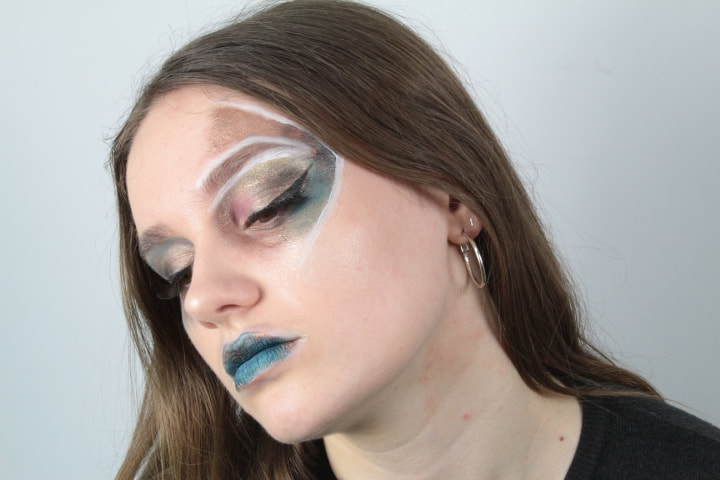
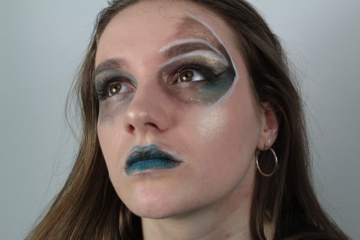
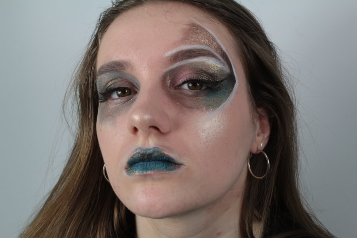
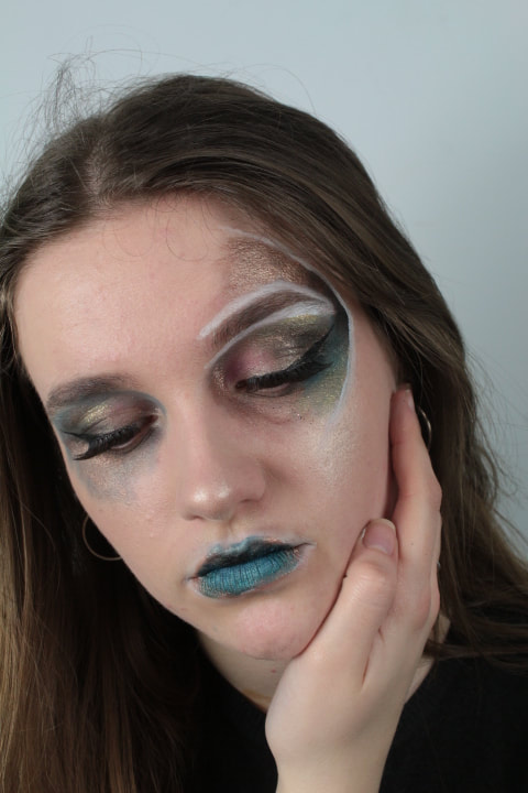
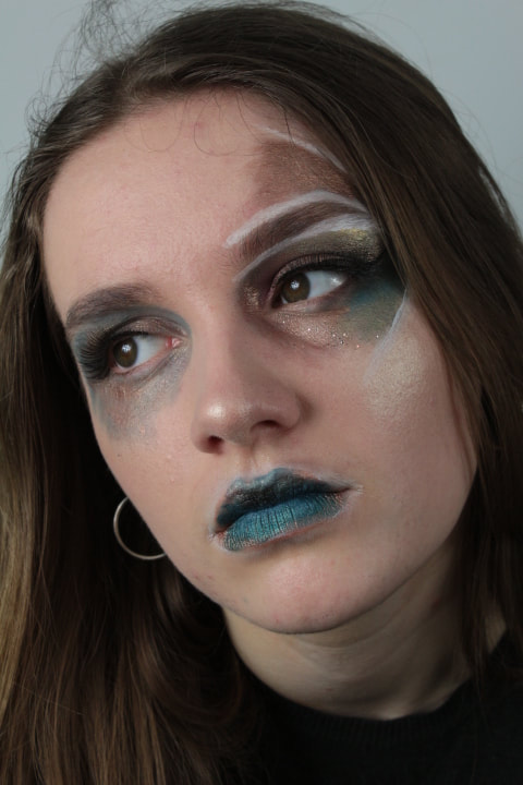
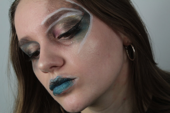
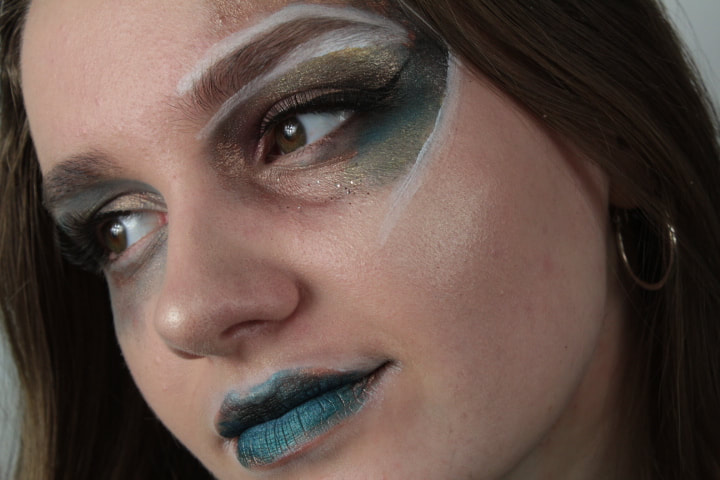
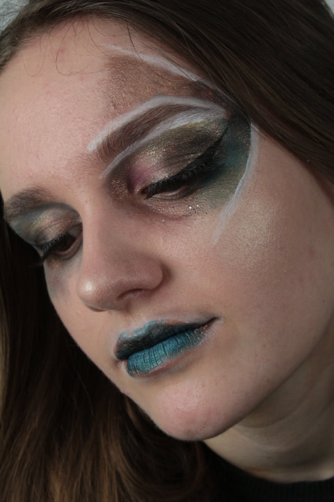
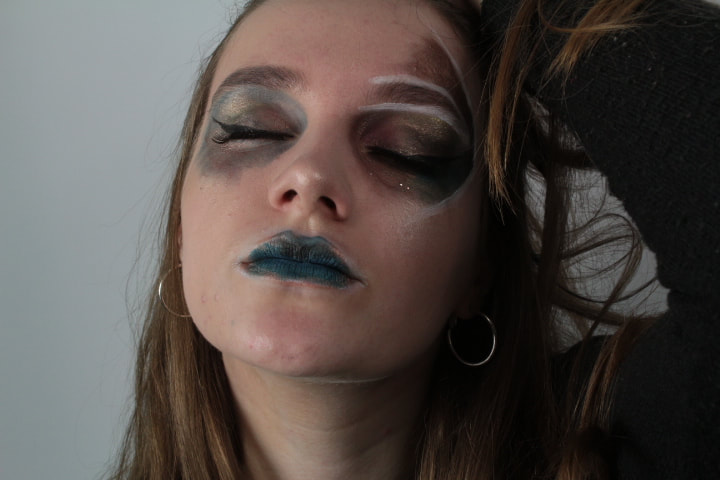
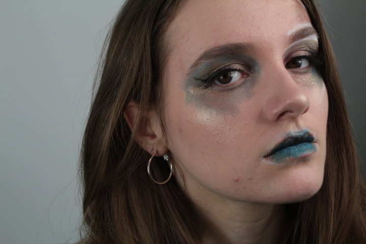
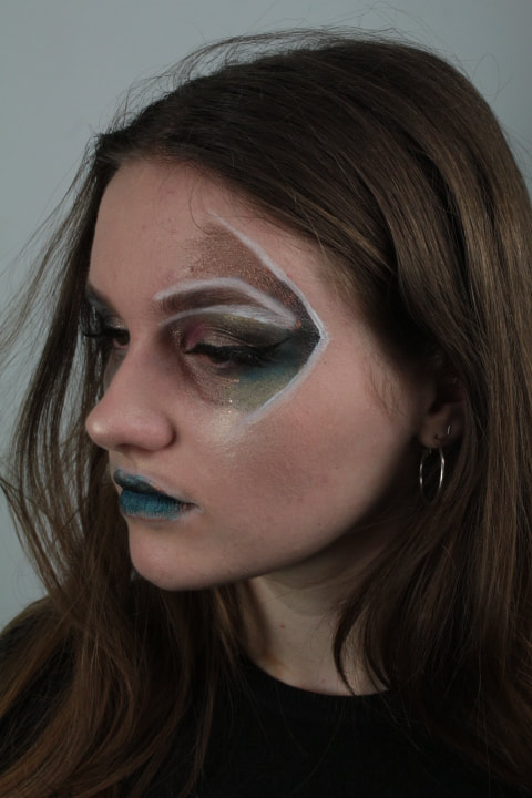
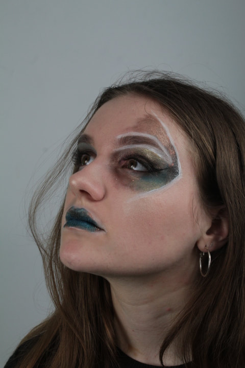
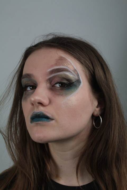
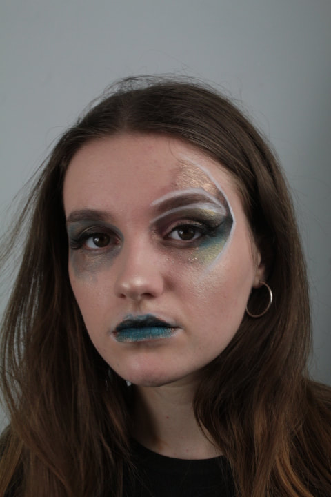
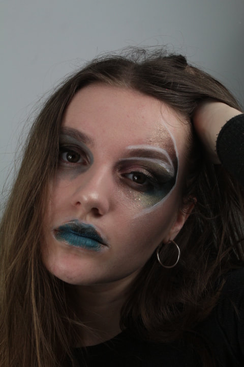
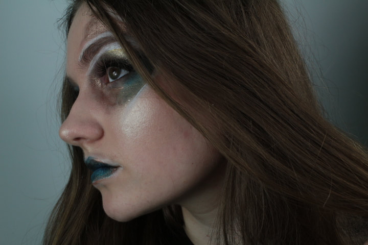
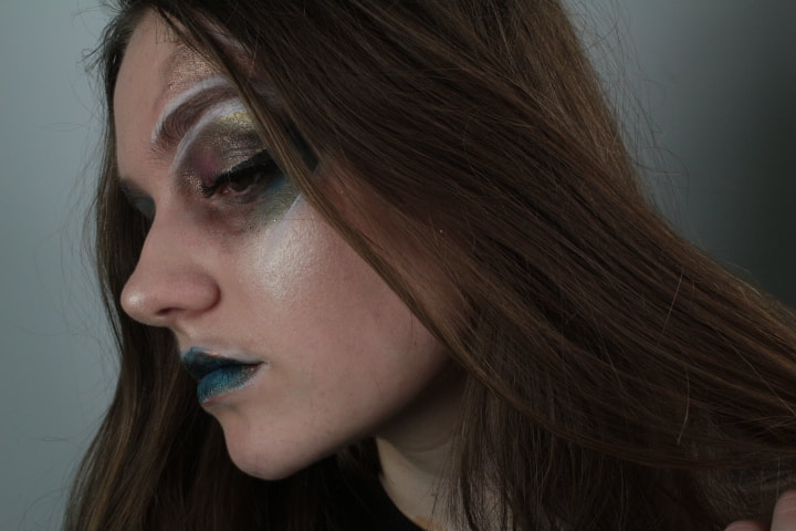
I consider these photographs my strongest due to the way the make-up stands out against my models complextion and the way the camera is angled and the model is positioned shows off the colours that produces an abstract and creative finish. The model has a seductive and moody expression on her face which corresponds with the teal colour make lips and eyeshadow which also causes her green eyes to stand out which is compatible with the gold and copper shimmer. The way the white lines are pleaced causes the models eyebrow and make up to stand out and reveals a unique and geometrical appearance that presents an art like effect. I am very pleased with the overall outcome of the photographs from this photoshoot and have many options for my potential final pieces.
Original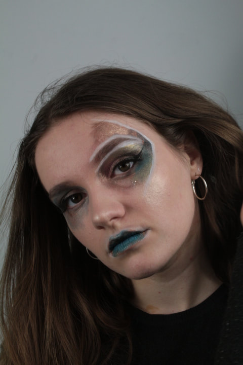
|
After photoshop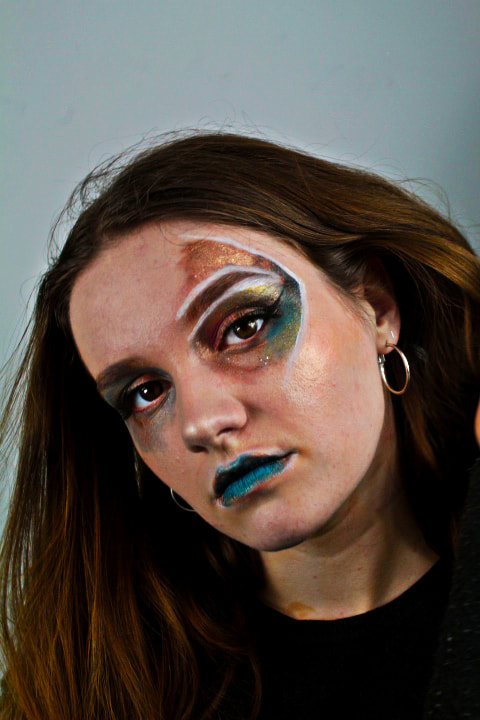
|
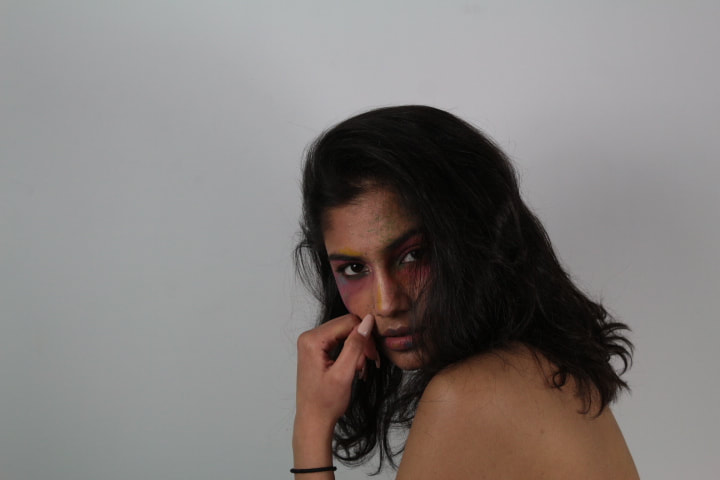
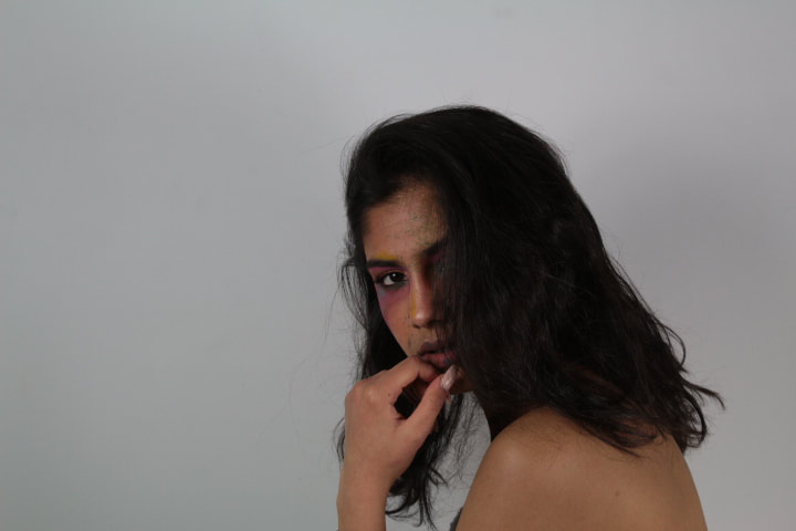
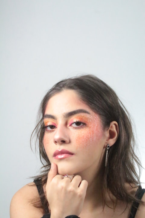
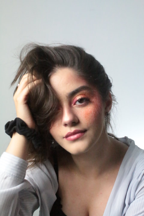
Photo shoot 3
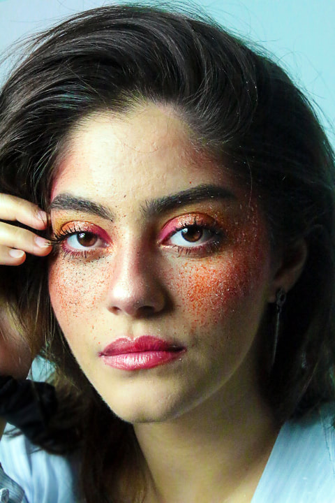
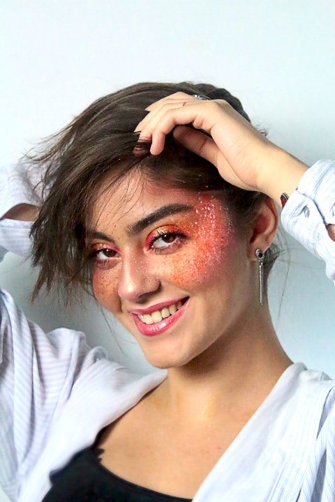
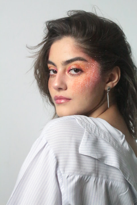
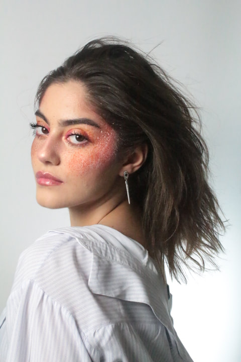
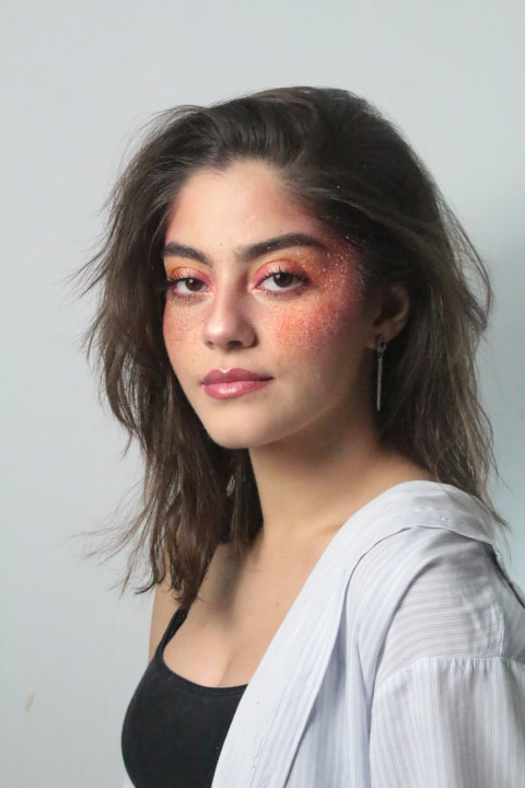
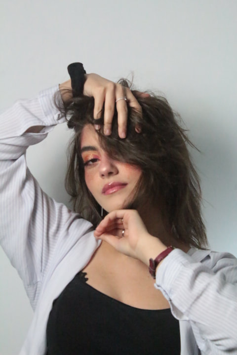
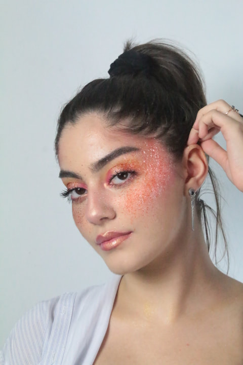
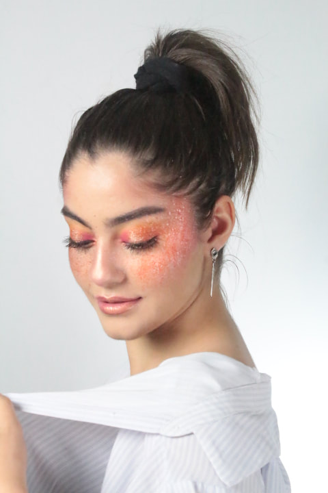
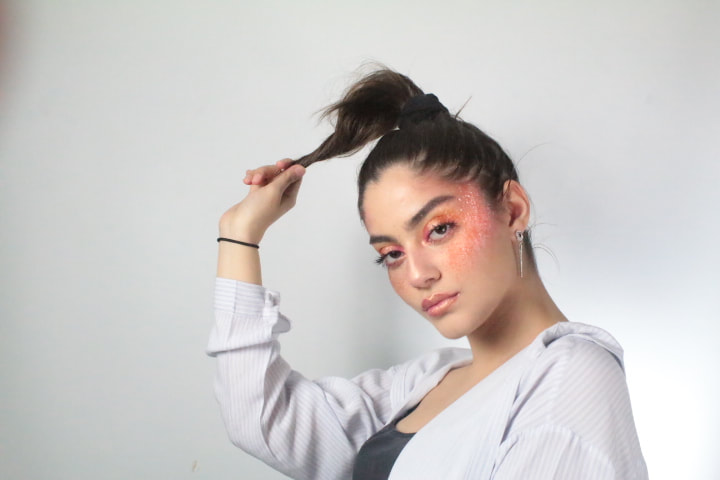
For this photoshoot I chose to work with warm colours, such as yellow, orange and red, these colours symbolise energy and life. I made these colours stand out by contrasting them with splatters of black paint on her left cheek and white paint on her left cheek. This brought the colour together and made the definition appear higher. I applied a lot of highlight and went for a sunset eye look where the colours of yellow, orange, pink and red blend together in order to create a sunset vibe. I also used glitter on her eye lids and on the centre of her lips to create detail and enhance the models features. The models brown hair, dark eyes and skin tone flattered the colour scheme for the maeup. Overall this photoshoot has been my most successful so far. I had my model relax and have fun in order to capture the best pictures that creates a fun and lively atmosphere, fitting into the connotations of the warm tones, yellow, orange, pink and red, giving the images energy and bringing them to life; Whilst also lifing the mood and making the admirers elated.
Strongest Pictures;
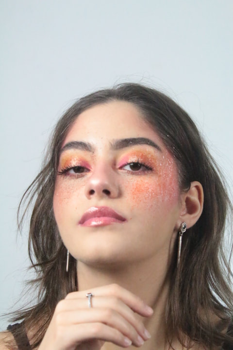
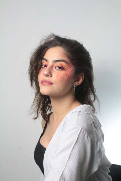
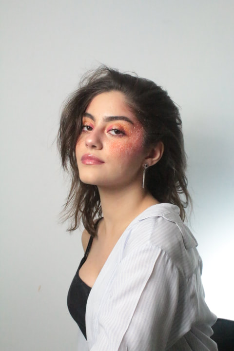
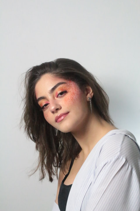
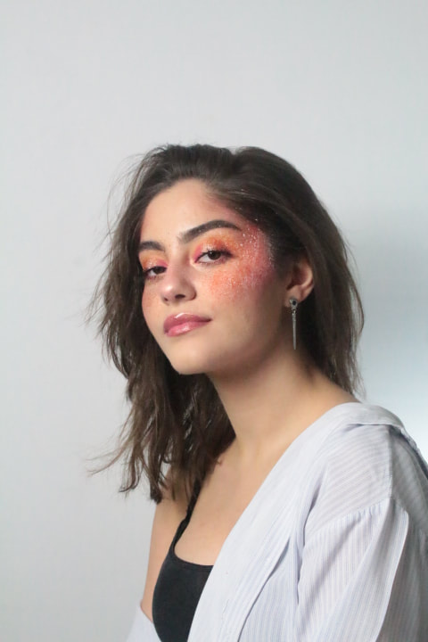
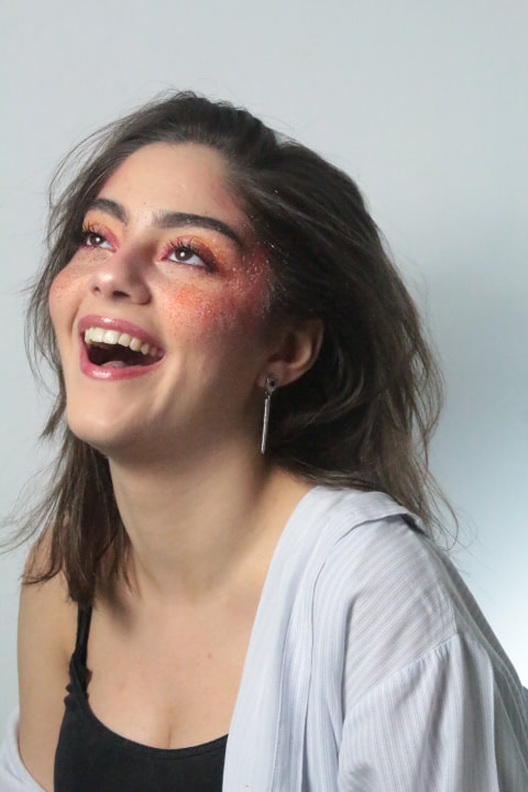
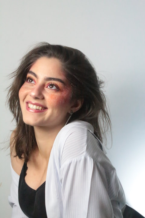
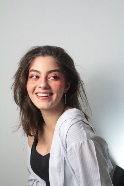
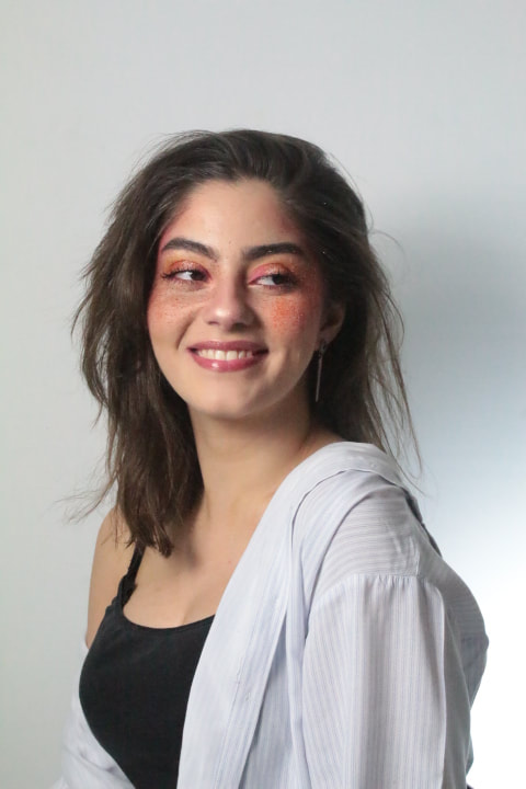
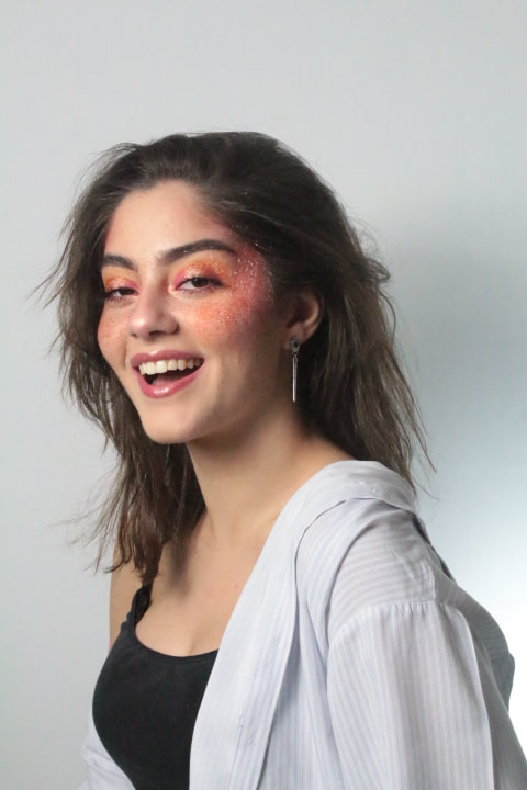
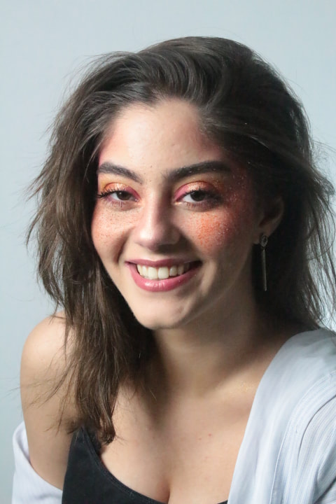
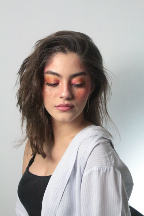
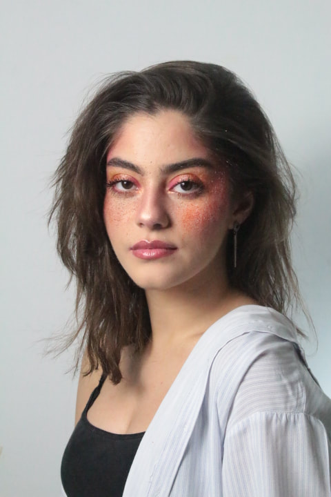
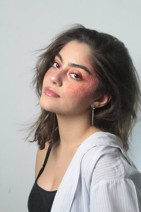
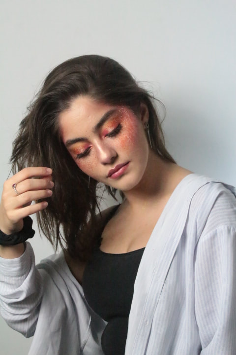
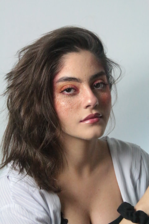
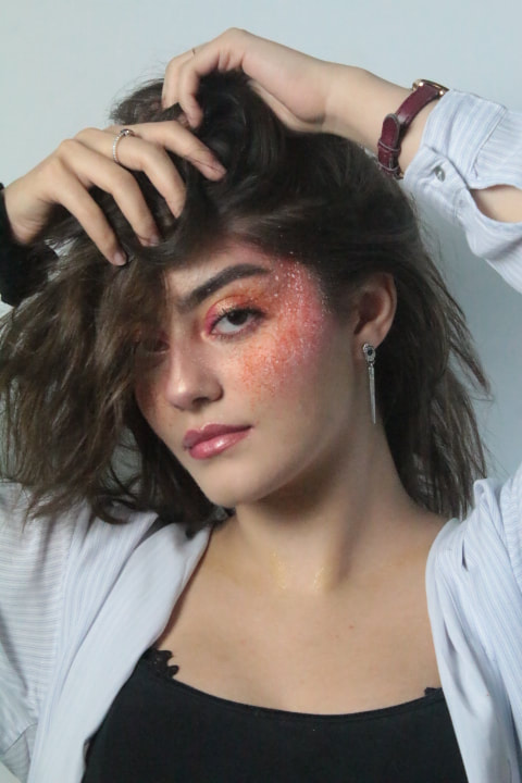
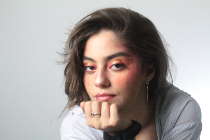
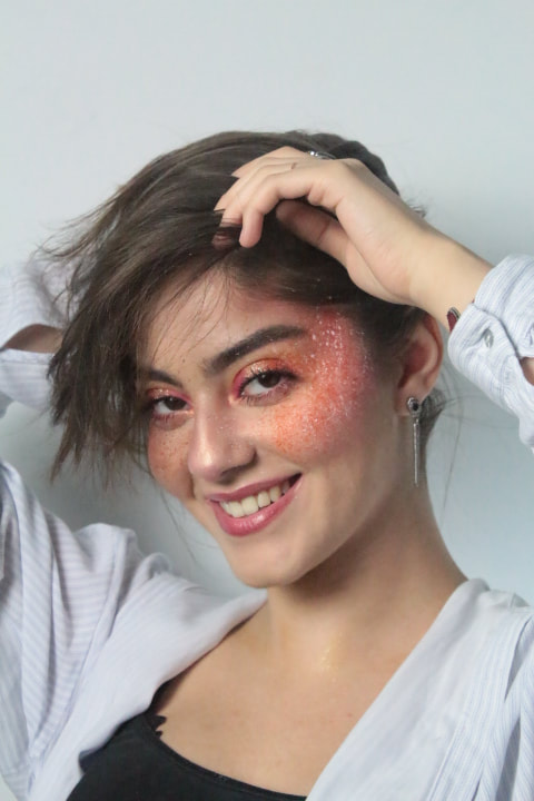

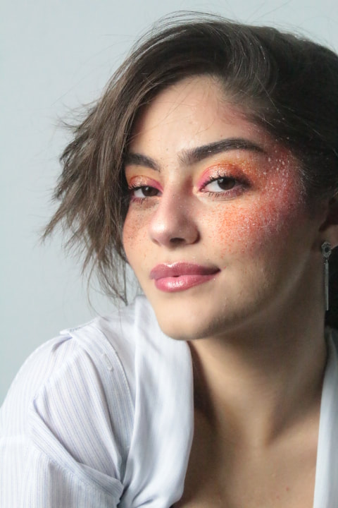
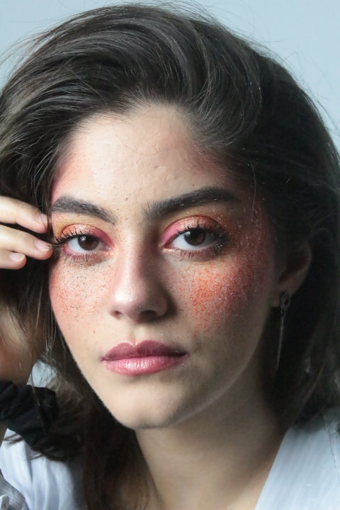
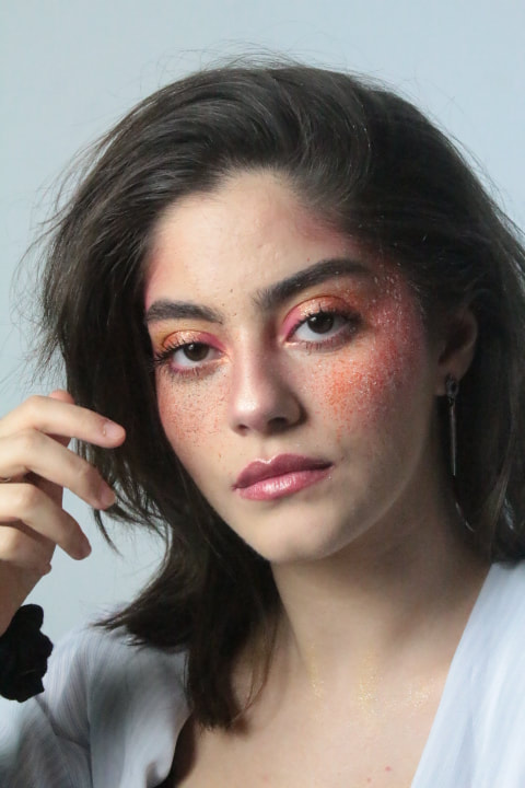
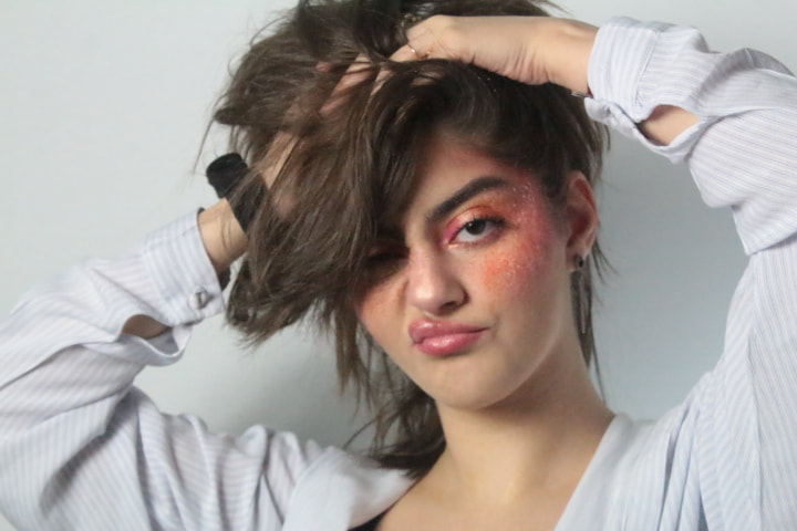
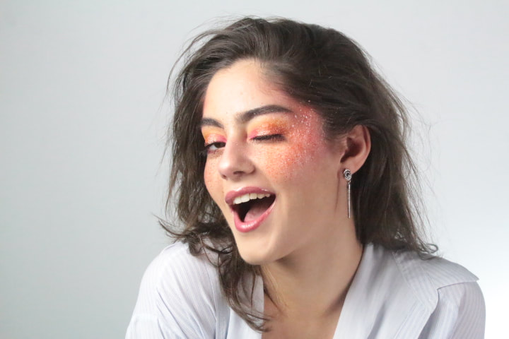
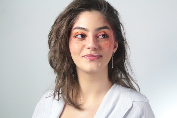
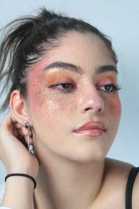
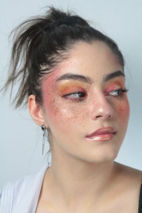
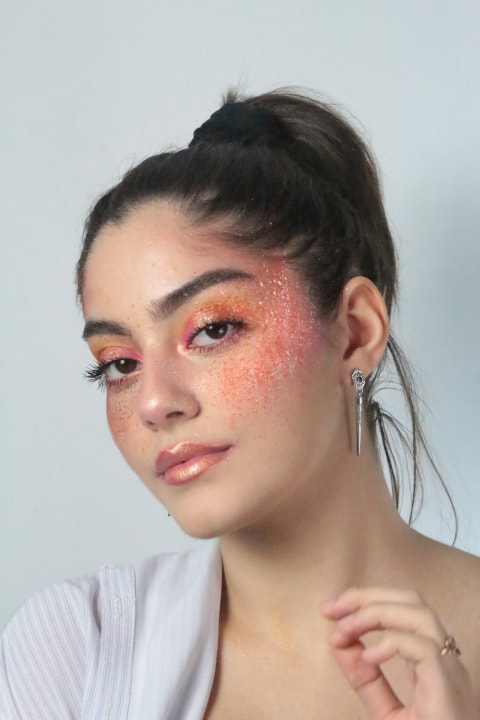
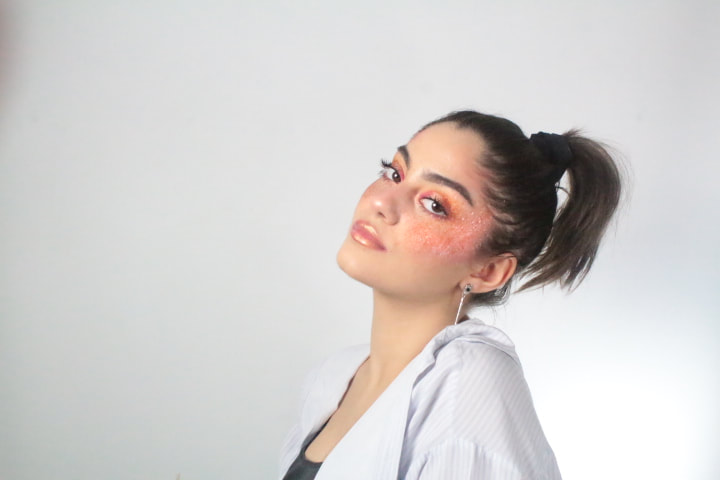
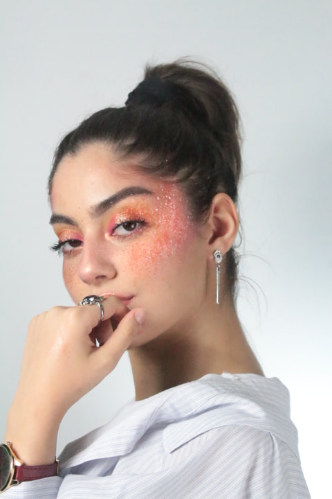
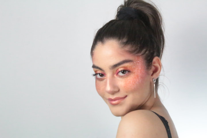
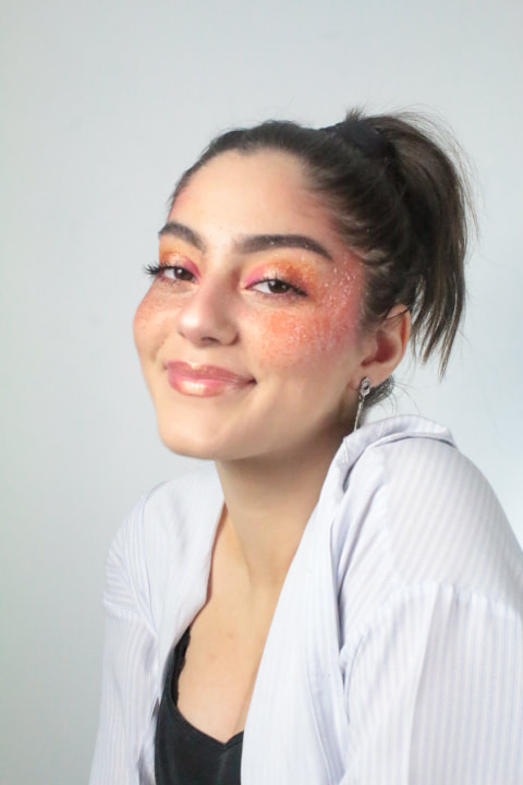
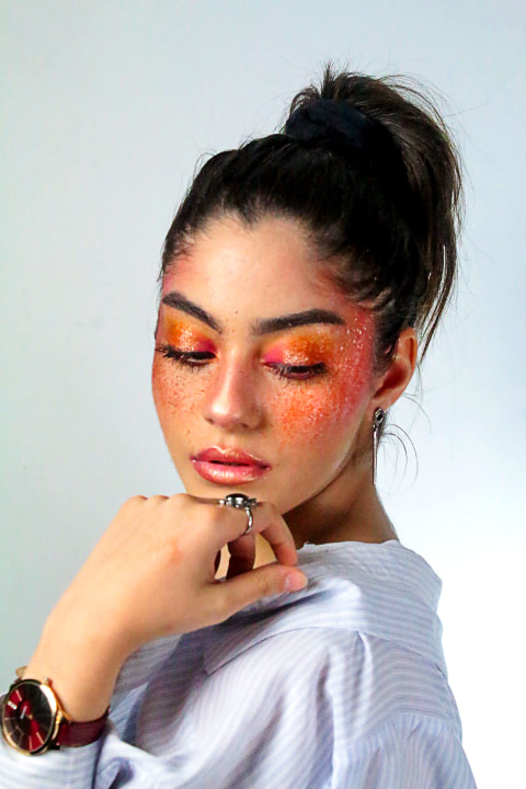
This photoshoot is one of my best so far which meant there were a lot of amazing and strong pictures which made it very difficult to narrow them down. The pictures I have chosen reflect a positive and energetic vibe through the use of the colour orange and the tint of gold, yellow and pink. These warm colours show off the models personality and also stands out against the models complextion. These are my strongest images due to the focus on the models face and the different camera angles, close up shots and medium shots which shows of different persepectives of the models makeup; the model is playful and fun and plays about with her poses creating energy and giving life to the photograph which causes an amazing and beautiful aesthetic which adds a lot of detail and character to each individual image as non of the images I have chosen as my strongest are all different and exciting. The model shows a seductive sexy side and a playful, pretty and cheerful side which builds up the overall appearance, making it stand out and draw the viewers eyes.
Original
|
After Photoshop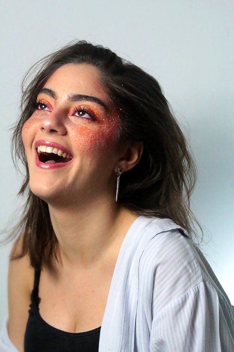
|
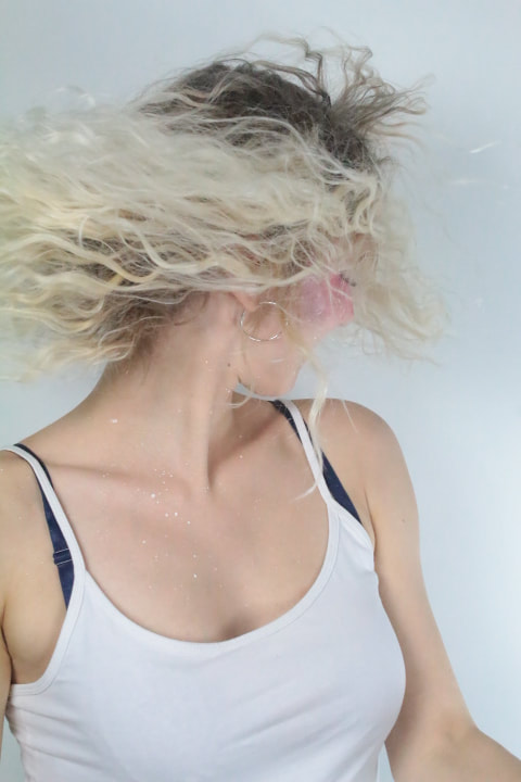
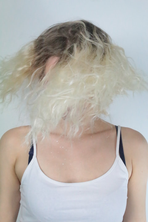
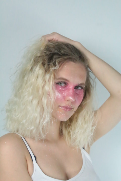
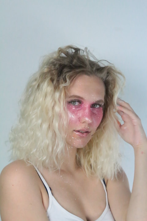
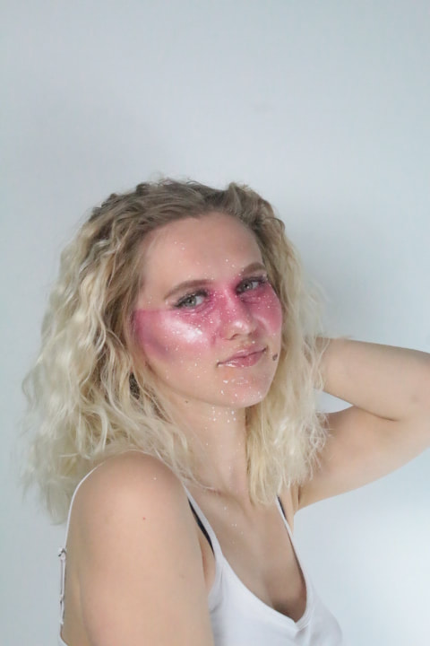
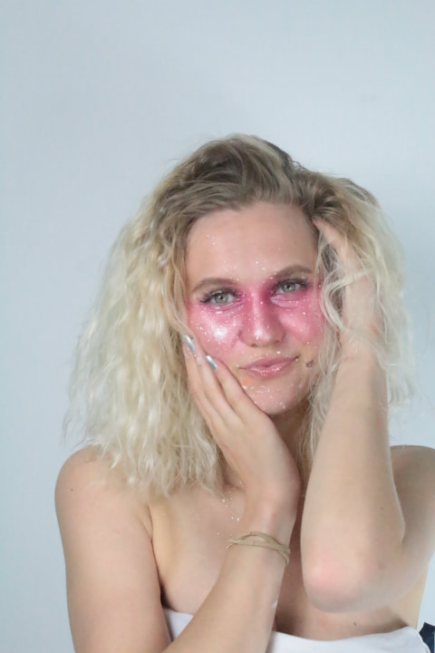
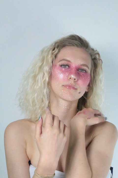
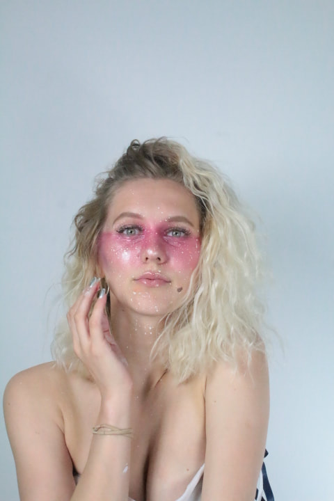
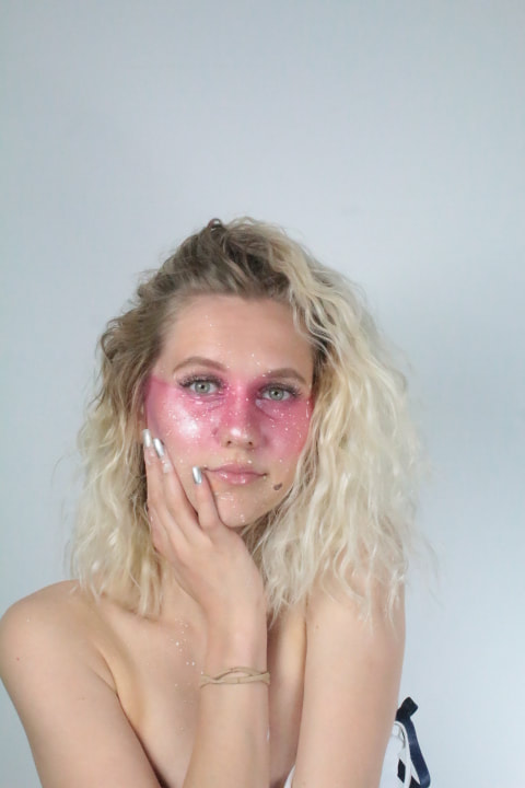
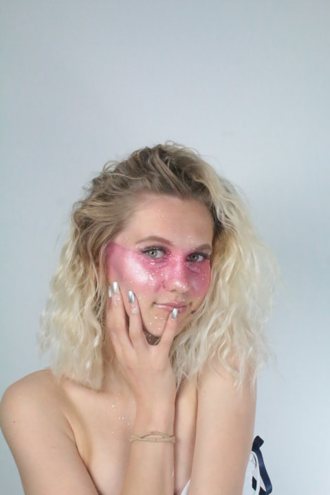
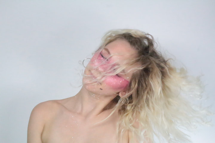
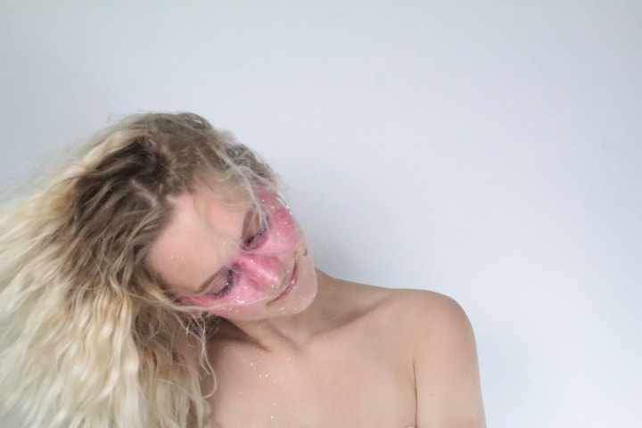
Photo shoot 4
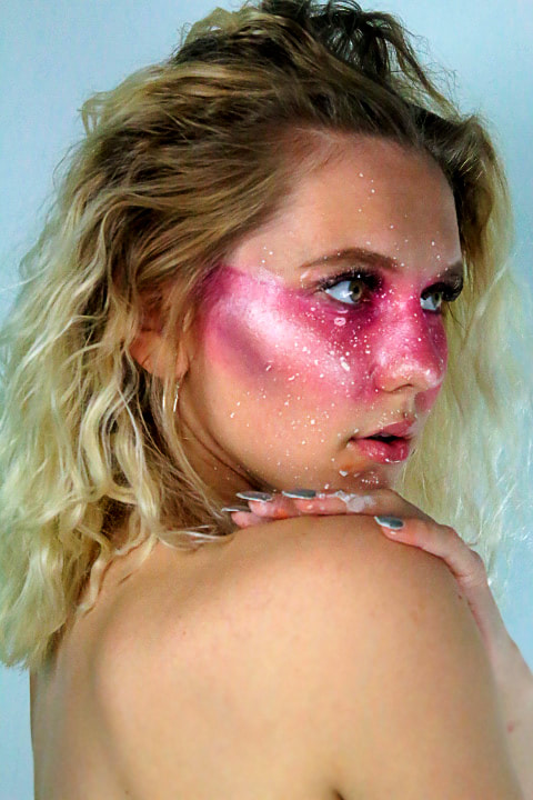
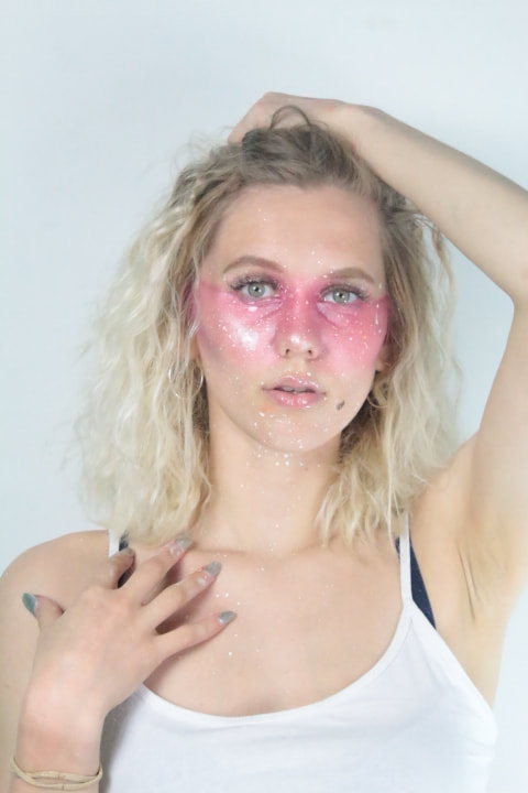
In this photoshoot I decided to stick to one colour (pink). The colour pink complimented my modles blonde hair and light skin tone as it gave her a healthy glow. I used pink as I wanted to create a cute, dainty look for my model. I created definition to the paint by adding splashes of white paint over the pink strip across her eyes. I used pink blush and eyeshadow to create the pink stripe across her eyes and nose which came out very pigmented, which allowed the colour to show up intensly on the camera. I got my model to have fun and play around as pink is a fun and lively colour, it is also known as a pretty colour therefore I applied false eyelashes to my model and contoured her face in order to enhance bring out the shape and define her facial features. Each photograph applies to the connotations of pink being sweet, nice, playful, cute, romantic, charming and feminine -This causes the admirer to feel upbeat and captivated. These images relate strongly to my 'splash of colour' unit and overall colour theme as it shows of the attitude pink creates and creates a colourful and aesthetically pleasing effect.
Strongest Pictures;
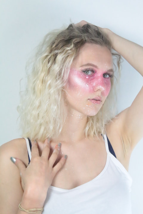
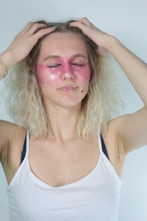
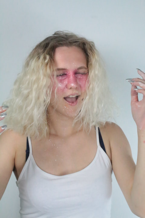
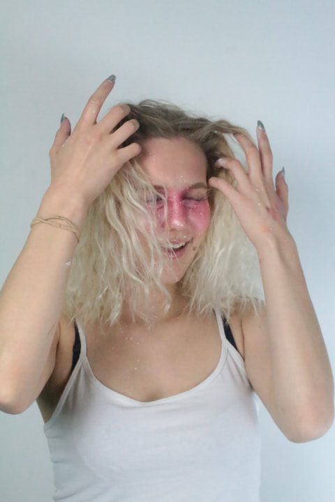
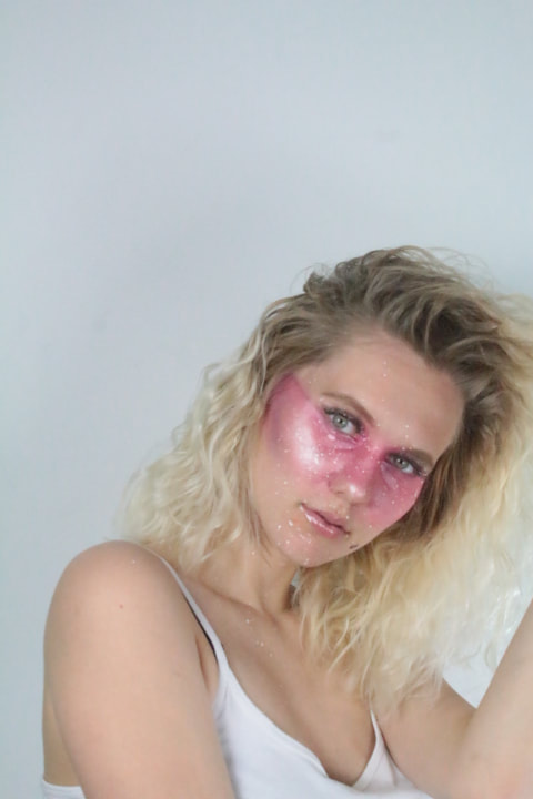
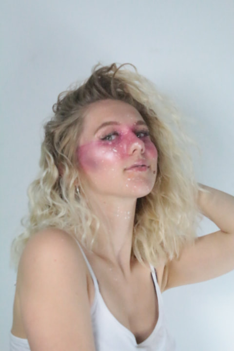
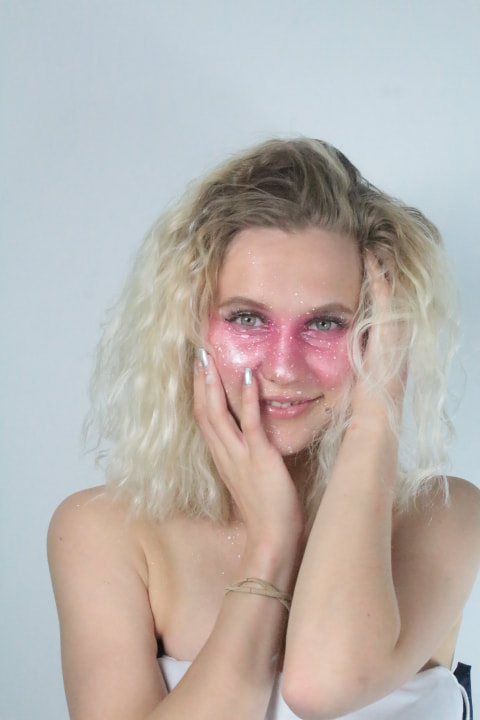
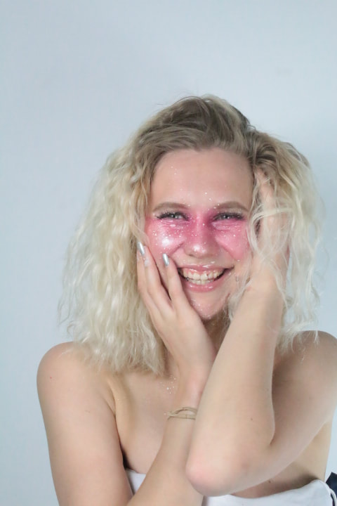
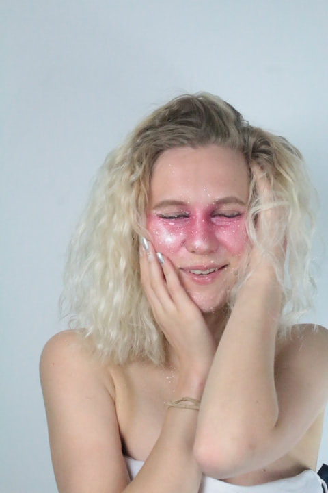
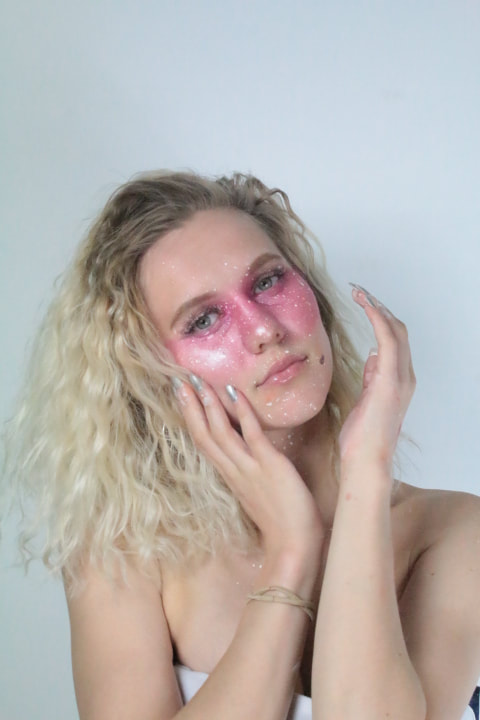
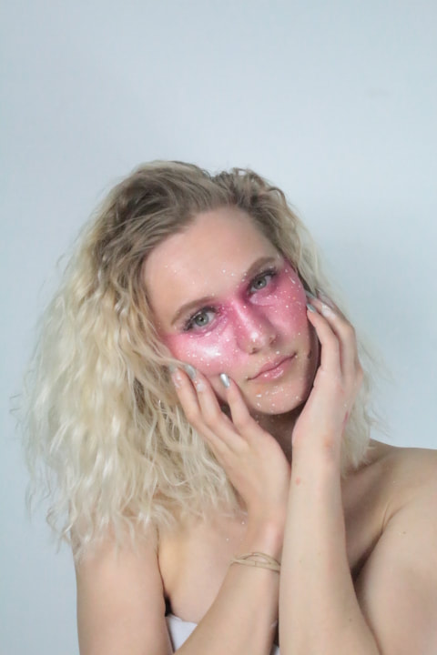
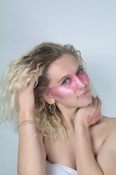
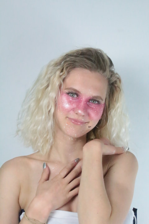
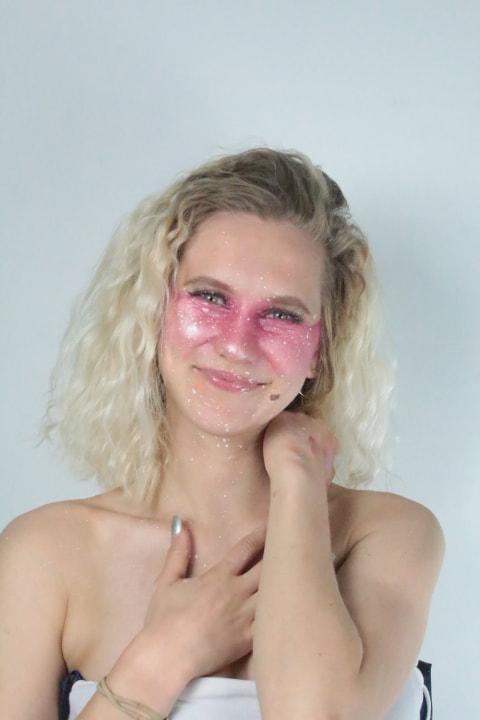
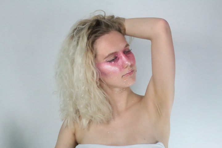

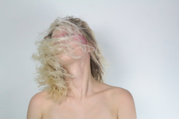
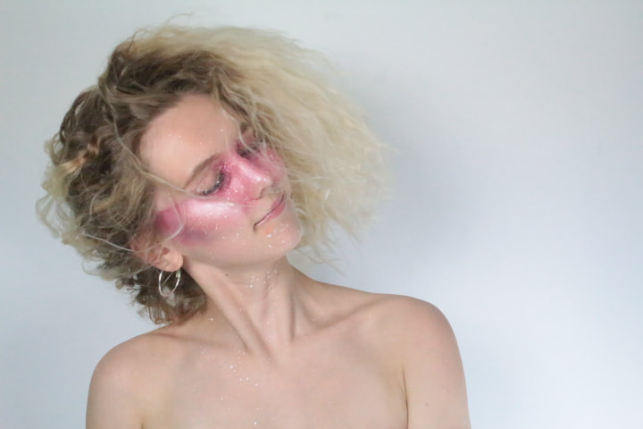
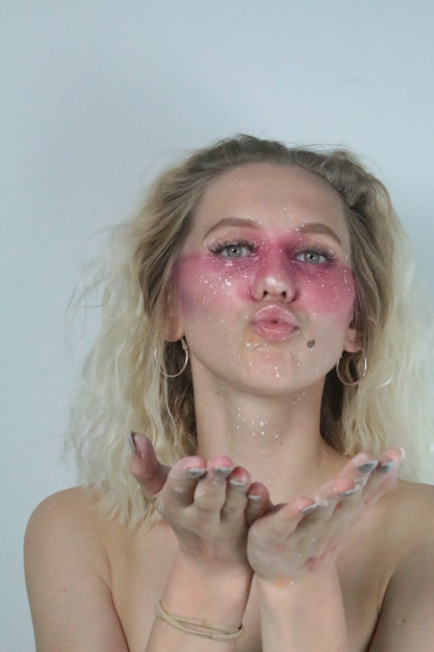
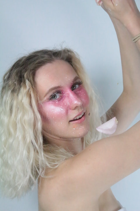
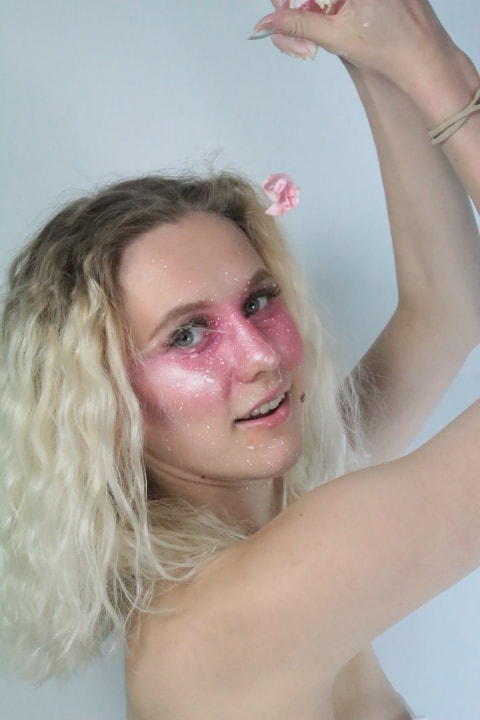
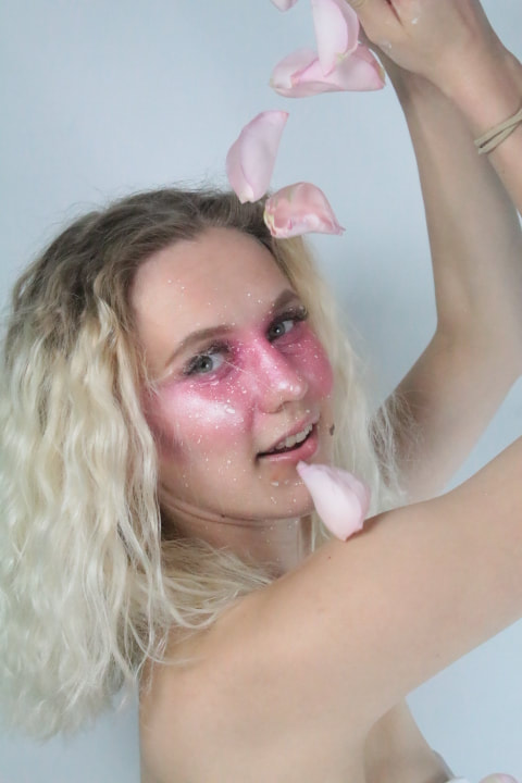
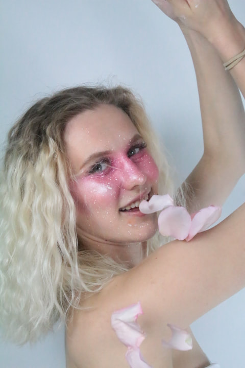
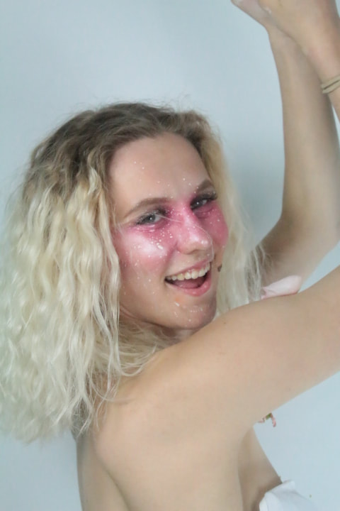
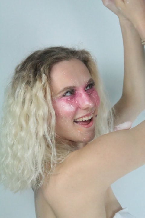
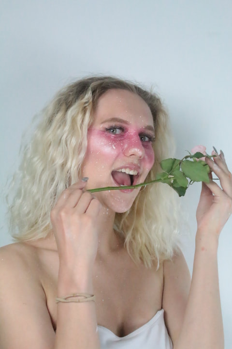
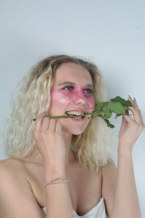
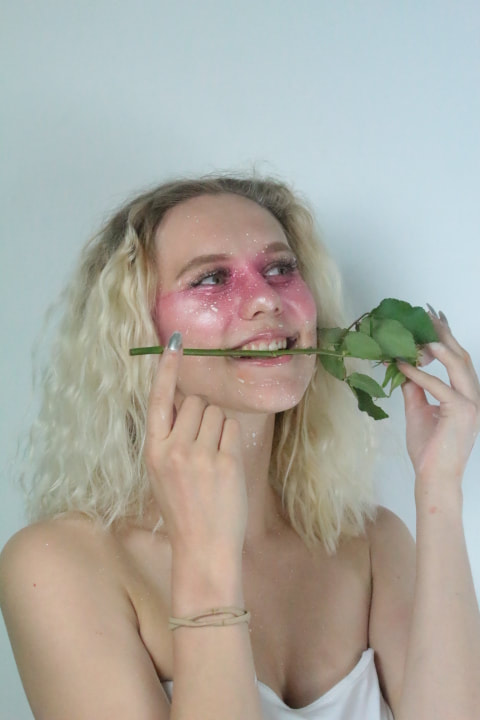
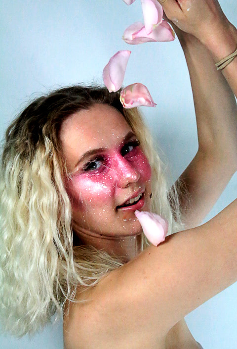
This photoshoot was another one of my strongest photoshoots as it portrays a romantic and calming effect whilst also broadcasts a joyful and creative aesthetic. The model is playful and child like as the colour pink is also assosiated as childish and vibrant. The pink enhances my models feminine features alongside her blonde hair and blue eyes creating a flirty and fun final impression. The angles show off the pink stripe and glow across her eyes creating a new and different dynamic each, the use of prop, the single pink rose and the pink rose petals, also exaggerates the concept of the flirty attitude, playfullness, and cheeky character.
Original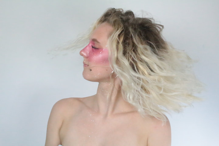
|
After photoshop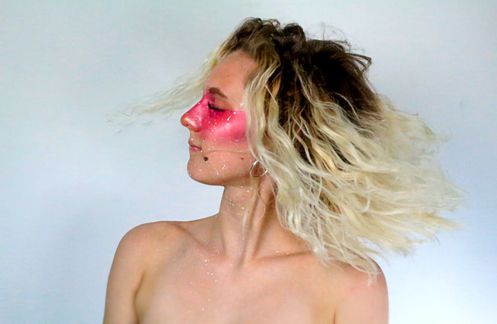
|
FINAL PIECE'S