What are the aesthetic effects of colour in photography?
|
The world of colour photography was first attempted in the 1840s; it continued to evolve as different theories were attempted from the hillotype process to three-colour processes which led to the additive colour. It wasn't until 1861 that the first successful coloured photography was taken by Thomas Sutton who had collaborated with James Clerk Maxwell who had invented the successful three- colour process in which Sutton used. In 1886, physicist and inventor Gabriel Lippmann used his knowledge of physics to create what we can consider the first color photograph without the help of any pigments or dyes. By 1906 Lippmann had revealed his process with colour images of a parrot, a group of flags, a stained glass window and a bowl of oranges. Color photography has been the main form of photography since the 1970s.
|

First colour photograph, suggested by James Clerk Maxwell but taken in 1861 by Thomas Sutton. The subject is a colored, tartan ribbon.
|
|
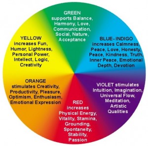
The aesthetic effects of colour in photography are what makes the photograph stand out, people are drawn to colour and it can channel emotions, change someones mood, enhance or manipulate appearances, connect to deep emotions and also stimulate memories. Choosing the right colours for your photograph can be difficult as it puts across what mood your want to send out. Mood is a common effect of colour photography as each colour can be related to a mood, for example brighter colours such as yellow or orange can uplift someones mood, where as colours such as blue or purple can be calming, and black and grey can lower mood. In my smoke bomb unit I used colours to represent a mood and explored how I could use the connotations of each colour to enhance that.
|
|
Another aesthetic that is shown when using colour photography is how it can adapt and manipulate someones appearance, for example black is known as a slimming colour, therefore if you wanted to have your model appear slimmer and more dainty you would put them in black clothing. Colour is also used to enhance the colour of someones eyes; depending on the eye colour you would find a harmonious colour which enhances the appearance of there natural eye colour, this is a common method used in order to create an aesthetically pleasing photograph. Not only can colour effect someones mood, it can also link to deeper emotions and stimulate people memories. These aesthetics have a huge effect of colour photography as each individual has a different perspective and emotion linked to colour, for instance a colour can cause one person to feel happy but to someone else it could be a negative colour and make them feel depressed. This is due to the memories that are linked in with the colour, subcontiously you don't think about how a colour can link to a memory and how it has an impact on the emotions attached, however colour is an immense factor when it comes to our emotions. Seeing a colour in a photograph can link to an emotion you have felt in the past and stimulate a memory whether that is a good memory or a bad memory.
The aesthetic that I feel has the most general effect on your photograph is the how it creates atmosphere; the atmosphere that is created depends on which colour scheme you go for. An example of a few is a monochromatic colour scheme, this is the use of a single color in differing shades-this can be a clean and interesting look, it's soothing and pleasing to the eye especially in blue or green hues. Another example is the use of a complimentary colour scheme. This is the use of high contrast of colour by selecting colours directly opposite from one another on the color wheel (such as pink and lime green). This puts a warm color with a cool color and is aesthetically pleasing to the eye. Finally, the use of a triple colour scheme uses three colours that are equally spaced from each other around a colour wheel; it allows for a harmonious color scheme. It's important to remember that color is the first thing registered by the audience of your photograph. If that is pleasing, they will be intrigued by your work and are more likely to view more of your work, if it's displeasing you may lose them in a nano second. So it tis important to select colours that will triggers the emotions that you want to put across in your photograph.
The aesthetic that I feel has the most general effect on your photograph is the how it creates atmosphere; the atmosphere that is created depends on which colour scheme you go for. An example of a few is a monochromatic colour scheme, this is the use of a single color in differing shades-this can be a clean and interesting look, it's soothing and pleasing to the eye especially in blue or green hues. Another example is the use of a complimentary colour scheme. This is the use of high contrast of colour by selecting colours directly opposite from one another on the color wheel (such as pink and lime green). This puts a warm color with a cool color and is aesthetically pleasing to the eye. Finally, the use of a triple colour scheme uses three colours that are equally spaced from each other around a colour wheel; it allows for a harmonious color scheme. It's important to remember that color is the first thing registered by the audience of your photograph. If that is pleasing, they will be intrigued by your work and are more likely to view more of your work, if it's displeasing you may lose them in a nano second. So it tis important to select colours that will triggers the emotions that you want to put across in your photograph.
|
The photographers that have inspired my colour photography are Sarah Leal, Nadine Schonfeld, Ruo Bing Li, Andra and John Rankin. Sarah Leal brings a vibrant and luminous atmosphere to her glow in the dark photographs, the colours draw your eyes to the model which creates an aestheticly pleasing appearance as the vivid colours lift your mood instantly. The aesthetic effects of the glow in the dark, neon colours are the feelings attached with multiple colours combining, contrasting and yet complementing each other strongly together. Another photographer I looked at that uses colour is Ruo Bing Li, even though I looked at her black and white paint work as inspiration for my black and white unit, I had also been inspired by her colour paint photographs. Her use of primary colours against more neutraul colours and tones creates a dramatic appearance.
|
|


Rankin uses a huge variety of different techniques and ideas, focussing on portraiture; Rankin is known for his very abstract style. Despite Rankin varying from black and white to bold, vibrant colours, his colour photography is what stands out to me the most as it has an eye catching effect through its explosion of colours. Rankin uses colour in order to atract people to his work and coordinates his colours in a way that brings pleasure to the audience.
My main influence is photographer Andra as she brings a different aesthetic meaning through her colours, for example her use of vibrant colour make-up produces an uplifting yet calming outcome as it not only connects with a persons mood and emotions but it also creates an inviting and cohesive display.
My main influence is photographer Andra as she brings a different aesthetic meaning through her colours, for example her use of vibrant colour make-up produces an uplifting yet calming outcome as it not only connects with a persons mood and emotions but it also creates an inviting and cohesive display.
My examples


To sum up, during my time as a photography student I have discovered that I enjoy working with colour. My unit for my coursework was colour and I have experimented in many ways to represent it, including moods, enhancing colour with make-up, paint and through vibrant glow in the dark paint. I have mainly worked with portraiture as I love to work with people, and I am able to create my own artwork using my model as a blank canvas. The aesthetic effects of colour are important to remember in order to creating the perfect final piece and putting across your own ideas and creativity for people to enjoy.
